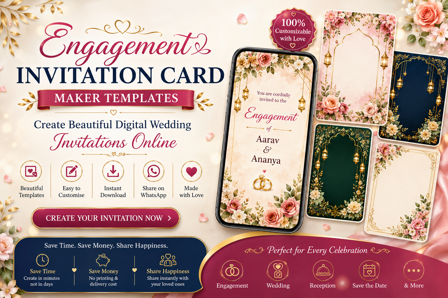
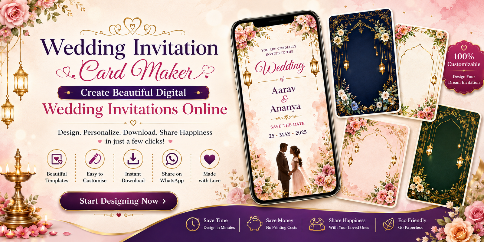
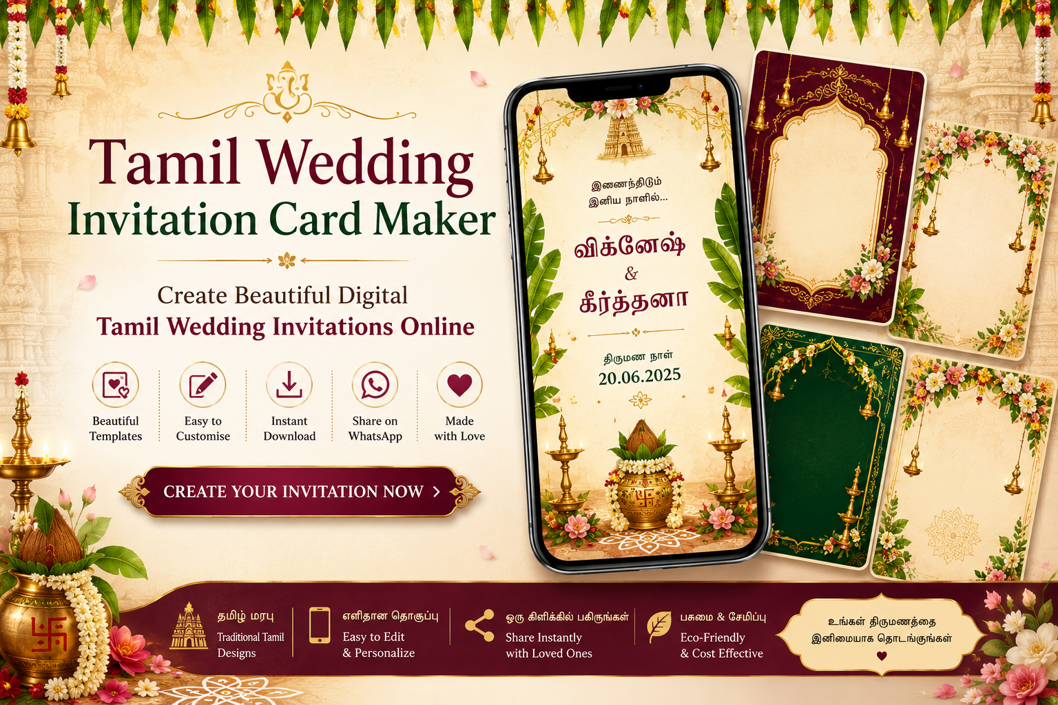
Great wedding invitation design balances tradition with readability. Your guests will mostly view the card on mobile — so contrast, font size, and spacing matter more than tiny decorative details.
Color palettes that work
- Classic Tamil: maroon, gold, and cream
- Modern minimal: blush pink, sage green, and white
- Royal traditional: deep red, purple accents, and gold borders
Font pairing tips
Use a decorative heading font for names and a clean body font for event details. Avoid more than two font families on one card.
Mobile readability
Keep body text large enough to read without zooming. High contrast between text and background improves sharing on WhatsApp.